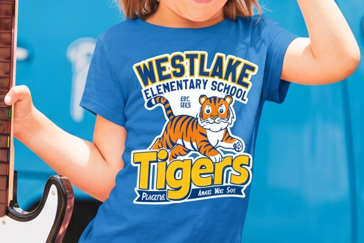
Westlake Elementary: Designing for Community Engagement
A one-week volunteer brand sprint: new mascot, logo system, and sticker set for my neighborhood school.
OVERVIEW
Westlake Elementary needed a new logo and mascot for their t-shirts and everyday school items. They were in a hurry to get a new design ready, and without a new idea they would use the previous design again.
My neighbor, who is on the Westlake PTA, asked me to design a new logo and mascot so they could print it on t-shirts and everyday items and kids and parents could show their school spirit.
CHALLENGE
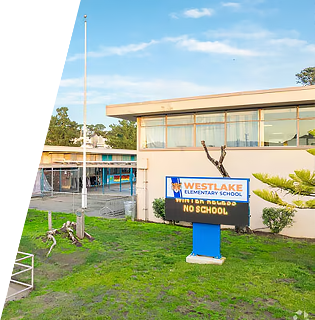
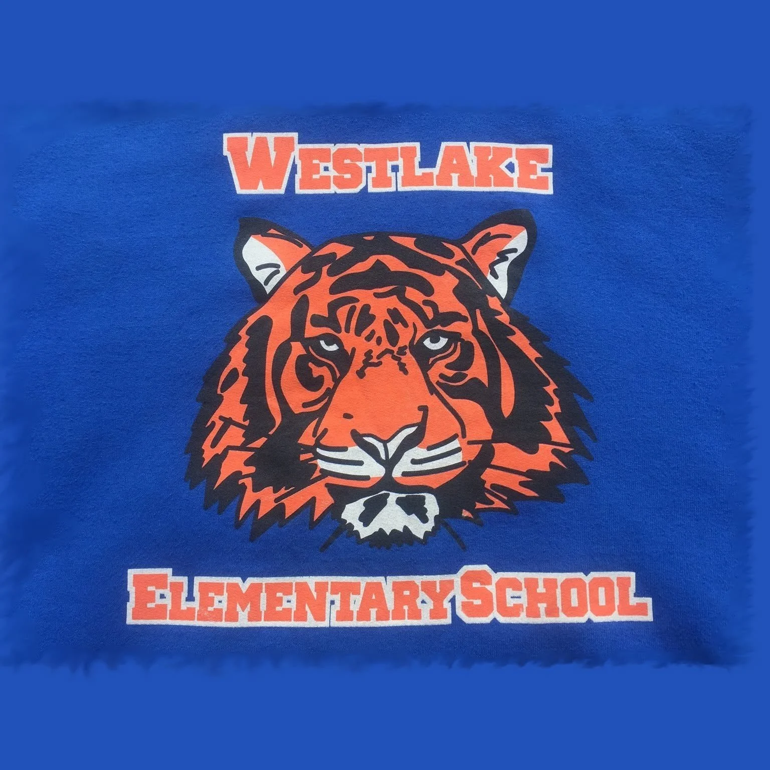
The school had one week to get a new design ready. Otherwise, they would fall back on their previous design, which not everyone liked and which was difficult to print in the colors they wanted.
STRATEGY
With only a week, I did a “boots on the ground” interview with the head of the PTA committee. I asked her a series of questions about the problems they had with the old design.
IMPACT
Delivered in 1 Week
Full mascot system, two logo lockups, and print-ready files on the PTA’s deadline.
Built to Last
Simple shapes and a flexible palette so the school can reprint the mascot for years to come.
Extended Impact
When the board kept the old design for budget reasons, I turned the mascot into a custom sticker set used as raffle prizes at the school fair.
What do students and parents like and dislike about it, and why?
What I found: According to the PTA head, new students didn’t like it because it wasn’t cute or cool. Older kids thought it looked old. Parents didn’t want to pay for something that looked cheap.
What it meant for my design: The design had to feel fresh to students and look well made to parents.
What’s wrong with the old design?
What I found: The school kept reprinting an old design that no one liked.
What it meant for my design: The new design needed to be something people wanted, so the school wouldn’t fall back on the old one.
What do they want in the new design?
What I found: They wanted a design that new and old students would both like as they grow. Younger kids like cute designs, older kids prefer tough and cool, and parents don’t want it to look cheap.
What it meant for my design: The mascot had to be cute and tough at the same time, and look good enough that parents would be happy to buy it.
EXECUTION
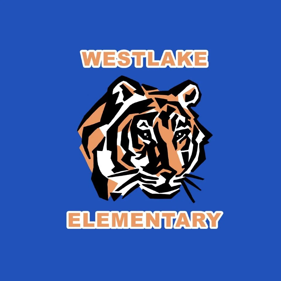
I took everything I gathered from the interview and created the first draft, making each design decision based on it. Beyond what the interview told me, I added two requirements of my own, because the school kept falling back on the old design and needed options for printing:
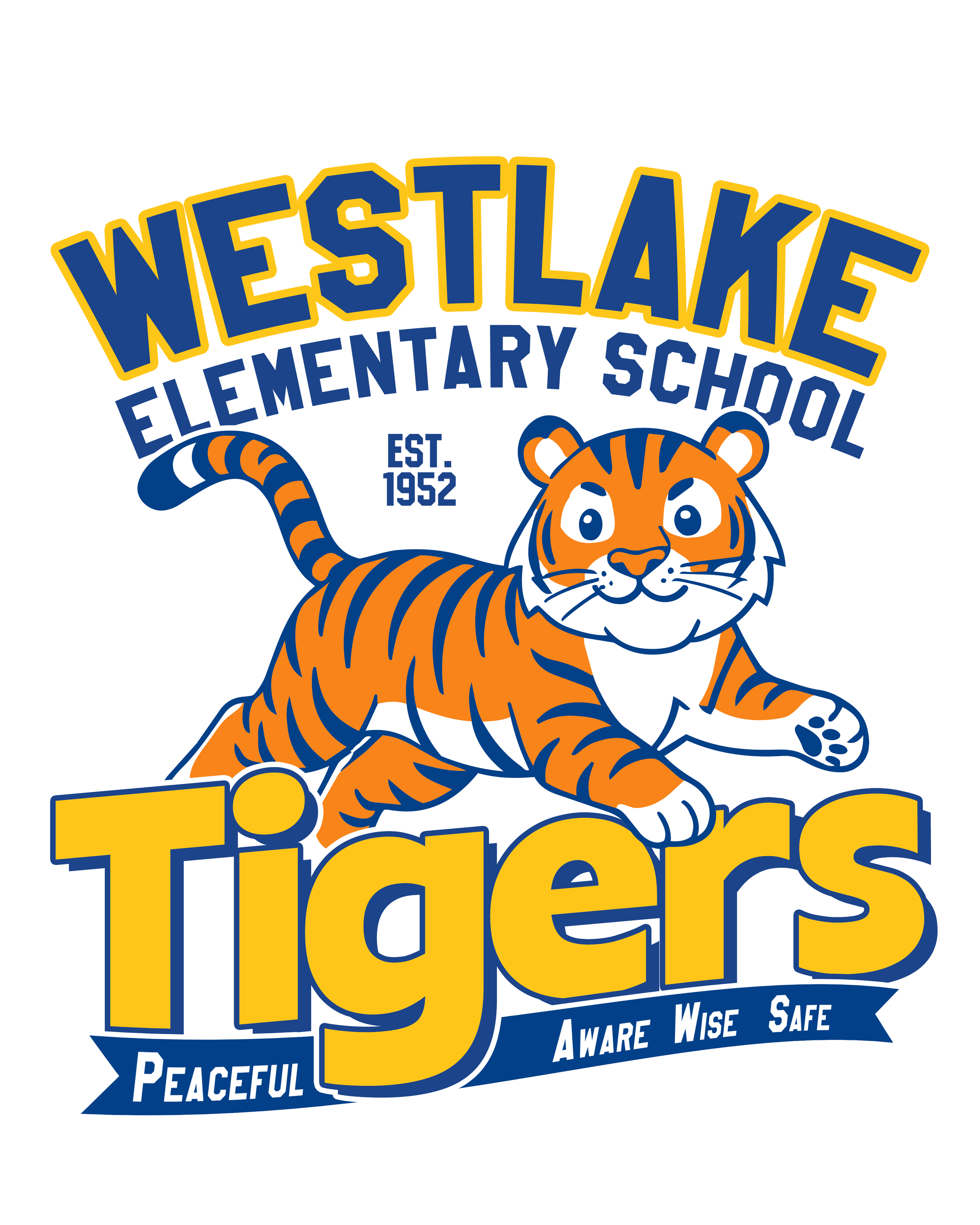
Built to last: Since the school kept falling back on the old design, I used bold shapes and a limited palette so the mascot won’t feel dated.
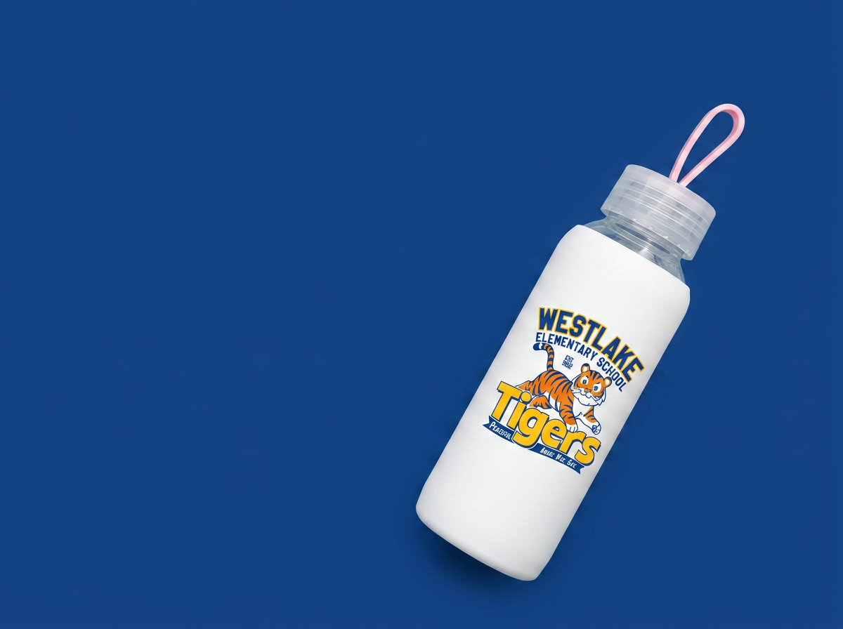
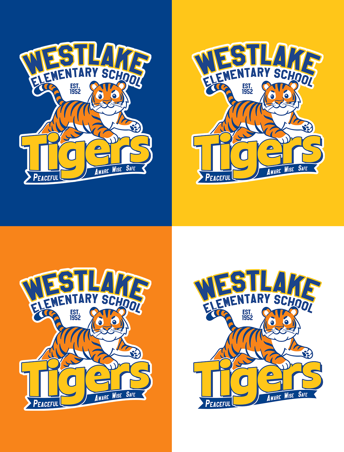
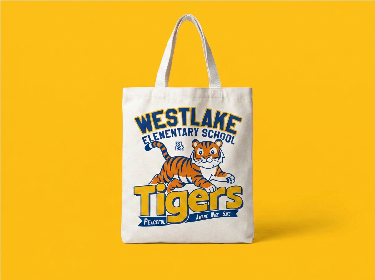
Built for the school’s colors: I designed the mascot to print cleanly in the school’s four colors (blue, gold, orange, and white), so they can reprint it on different products without redoing the artwork.
Product Mockup Showcase
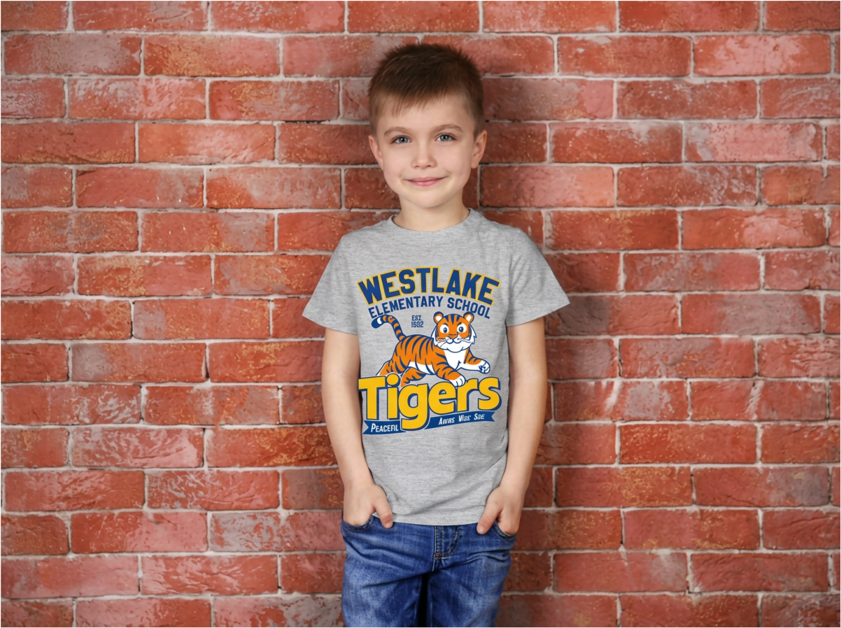
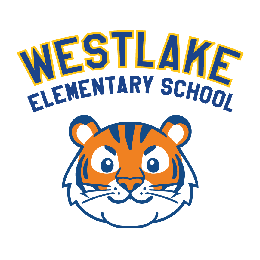
Cute and tough: Large eyes and a rounded face appeal to younger kids, while the strong brow and bold outline give older kids the edge they wanted.
RESULTS
Ultimately, the PTA board decided to stick with the previous design for their apparel rollout this year due to budget constraints preventing mass production.
Not wanting the new identity work to go to waste, I took the initiative to adapt extra graphic elements from the mascot design into a custom sticker set. The school loved the idea and successfully put them to use as raffle prizes at the school fair, giving students an exciting way to interact with the new mascot right away.

REFLECTION
If I had more time on this project, I would:
Check the budget with the PTA before designing: The board went with the previous design because they couldn’t fund mass production. Knowing their printing budget up front would have let me design to what they could afford, such as fewer ink colors.
Get approval earlier: A one-week deadline left little room for sign-off. I would have shown a rough direction to the board early, so the final design wasn’t a surprise.